Wednesday, July 31, 2013

{ Spotted... }


Our friends at HOMESTYLE magazine have been getting crafty with the exclusive postcards we created for the launch of our new collection! Coupled with twine and pegs, these cards are perfect for creating an inspiration board or for sending a quick note to friends and family.


{ Inspired by... }


Amy accidentally stumbled across this Illustrators blog 'Drawn the Road Again', and was really inspired by it.
She likes how the compositions have a strong graphic design quality, and the illustrations are charming and beautifully hand crafted.


{ DESIGN POST }


I always have a total dilemma going on in my spaces - whether to go clean, fresh and 
minimal - or crazy with colour. I have to say that invariably 'crazy' and 'colour' win! 
What about you guys? What do you think of my Citta Design make-over below?
Forget me Not Pillowcases $49.90 (duvet sets also available in various sizes) / 


Tuesday, July 30, 2013

{ Colour of the Week }


We like the soft buttery-ness of this vintage yellow hue. 
Custard squares, high tea & buttercups, it is a truly feminine colour.

{ Spotted... }


A great interview with our head designer Imogen, has gone live over at Fancy!
Be sure to check it out, it's really interesting.

{ SNAPSHOT }

A monthly feature showcasing Citta Design product in the homes of Citta Designers - not only do they design the product, they love to own the product too!

Emma put the Junction cushions, from our Winter 2011 collection New York Stories, on her bed, and loved how they looked with her homemade floral pillowcases.


Friday, July 26, 2013

{ Instagram Pic of the week }


Wall display inspiration - the perfect way to display painted ceramics, bold cushions or your favourite handbag like art on your walls. #yourcolourfullife.

Check out more of our Instagram pics here.

Thursday, July 25, 2013

{ This week in the Office }


One of our Indian suppliers came to visit this week, bringing with him a suitcase full of interesting fabric samples and weaving techniques. We now have a collection of new ideas & techniques in mind for our next collection.

Wednesday, July 24, 2013

{ Design Completed! }


A finished copy of the customer catalogue was delivered today, and we are in love with the gold! We keep tilting the catalogue backwards and forwards so the light captures the gold and makes it shine.

Tuesday, July 23, 2013

{ DESIGN POST }


I adore the bright floral paintings artist Lulie Wallace creates. I would hang one in my living room and would never feel the need to buy fresh flowers again.
Until the day I own one (!!), I have to settle for a print out of this painting pinned to the moodboard next to my desk.

Based in Charleston, South Carolina, Lulie paints with acrylic on board. 

'A painting of flowers in a vase is an obvious subject matter to most collectors or observers, but what I want my art to achieve through color, shape, and texture is the balance of uniqueness, character, and honest materiality.'

Alongside her paintings Lulie has a range of textiles, sells fabric by the yard and even accepts commissions.

Posted by Carina.


{ Colour of the Week }


Grey, rainy days typically come to mind when we think of a Winters day in London (and New Zealand for that matter, as I look out the office window).
Instead of being a boring, drab colour, we celebrate Dove grey and Charcoal as a great staple – the perfect partner to a bright colour, as well as beautiful on its own.


Friday, July 19, 2013

{ This Week in the Office }


After another week of late nights, Emma sent the Summer customer catalogue to the printer, and has approved the press pass for print. We look forward to having a copy in our hands mid next week.

{ REGULAR FEATURE }


Beautifully simple concept stores.

I have always been a fan of Swedish brand COS. Their beautifully simple clothing, clean lines and product craftsmanship make for stylish and practical clothing classics. I also admire the innovative ways they showcase their clothing – through interesting brand collaborations with designers who equally pride themselves on craftsmanship and simple design.
Two of their latest collaborations that caught my eye are detailed below -
COS MOBILE POP-UP STORE IN MARSEILLE
To celebrate Marseille being named this year’s European Capital of Culture, COS created a mobile pop-up store to be placed in the city’s centre for one week.
Designed by chmara.rosinke, it is made from pine treated with orange and linseed oil, combining functionality and clean lines to complement the hand-chosen selection of garments on display. 

COS / SALONE DEL MOBILE & BONSOIR PARIS
For the second year, COS is celebrating Salone del Mobile, Europe’s largest furniture design fair with a pop-up concept store created by French design duo Bonsoir Paris. I love the customisable nature of this clothing racking and the ease with which it fits together and moulds around the space it is set-up in.

Posted by Abby.

Thursday, July 18, 2013

{ Inspired by }


Metallic gold.
Look out for a spot of this in our Summer 2014 catalogue (which is going to print this week!)

Image 1 found via pinterest | 2 | 3 | 4 | 5 & 6

Tuesday, July 16, 2013

{ Colour of the Week }


Teal is for people who love blue or green, but want something a little off-beat. There are many interesting and off-beat characters in London, so it was the perfect addition to the winter palette.

{ Spotted }


Just spotted this bowl, from our Summer Love Mexico range of 2010, in the home of blogger Amy Moss from Eat Drink Chic. It looks right at home nestled amongst the bright colours of her workspace and living areas.

Monday, July 15, 2013

{ DESIGN POST }


July In My Humble Home

In my very first Humble Home blog post I am already breaking the rules! The {after} pics above are not from this month at all, in fact they are from more than a year ago and a home I no longer own. However, I thought it would be a nice intro to what my blog posts will be all about.
I'm now on to the renovation of house #2 and I plan to document the progress, whether it be a freshly painted wall, a moodboard of ideas or even a pretty new acquisition finding its place in my home.

Join me on this journey and see my home transform from a {quite frankly} horribly, rundown dive into a lovely, creative and comfortable home {oh the pressure!}.

See you next month with pics of the new house and a few of the improvements thus far!

Emma x

After Photos: Shot by Kelley Eady Loveridge for Your Home & Garden {July 2012 issue}


Friday, July 12, 2013

{ REGULAR FEATURE }


Smart Storage

I love walking into a retail store that has thought of clever ways to display its product. The inventive use of interesting objects, or the creative design of shelving and storage make the products seem more tactile, unique and covetable. Creating a visually engaging shopping environment allows you to indulge in a whole new retail experience.

Keeping this in mind, here are some of my favourite examples of creative shop displays that could also inspire unusual storage solutions for the home. Why not display your beautiful possessions with the same attention to detail as the store you purchased them from?

Posted by Abby

Wednesday, July 10, 2013

WIP { Work in Progress }


It's all systems go in the design room this week. We have tight deadlines to meet, cushion ideas to sort through, stylistic cues too consider and colours to confirm. 

Friday, July 5, 2013

{ Instagram Pic of the Week }


Too cute! Little Edward is dreaming away on our Zoo Duvet Cover.
Check out more of our Instagram pics here.

Thursday, July 4, 2013

{ REGULAR FEATURE }


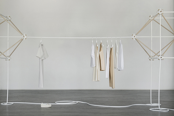
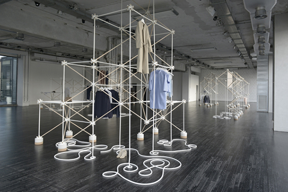
Window display inspiration: Yayoi Kusama

Yayoi Kusama is the Japanese artist behind some of my favourite window displays. The Queen of the polka-dot, Yayoi has been taking over Louis Vuitton’s windows and wrapping them in her iconic red and white geometric patterns to coincide with the launch of her collaborative collection with LV last year.  Her bold striped and polka-dot displays are iconic. The simplicity of her design, endless repetition and punchy candy-cane coloured shapes are an eye-catching and alluring feast for the eyes. I love the way a bold pattern can captivate shoppers as they walk past the windows.

Yayoi Kusama is as interesting as her window displays; an 84 year old artist who studied the ancient Japanese art of Nihonga painting, a rigorous formal style developed during the Meiji period (1868–1912). She has also lived voluntarily in a psychiatric clinic since 1977! An unusual woman with an unusual vision that really helped to enliven the brand image of Louis Vuitton.

Posted by Abby.

Wednesday, July 3, 2013

{ Inspired by }


The bold black & white geometric shape of this building contrasting against a rugged natural backdrop.

We have begun work on our Winter 2014 collection, which is currently seeing lots of black & white and bold patterns contrasting against natural tones and pastel colours.

Image source.

Tuesday, July 2, 2013

Colour of the Week { SCARLET }


A London collection without red, or Scarlet as we like to call it, just wouldn't be proper. Pillar boxes, telephone booths and double decker buses are synonymous with the colour scarlet and are great icons of the London cityscape.

Monday, July 1, 2013

{ Last Week in the Office }

On Thursday night we invited the Media over to view our new Summer collection. The week was spent preparing - speech writing, putting the final edits on a video and creating our goodie bag giveaway (pictured above). We received great feedback about the collection, and look forward to its release into stores later in the year.

A few photos from the Media launch below: